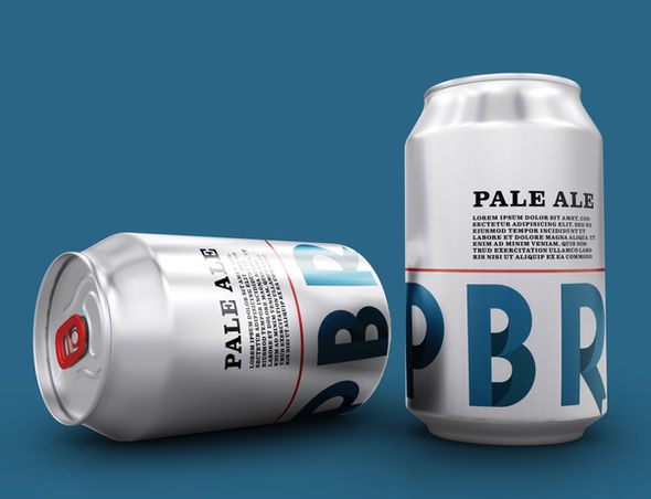
A blue ribbon beverage
Objective: Rebrand an existing and/or well known business
Business: Pabst Blue Ribbon
Goals: revitalize the Pabst Blue Ribbon Logo so it can achieve the brand's goal of appealing to a more contemporary generation.


The original logo is traditional and speaks to the brands roots, however due to the recent revival of popularity it should represent a trendier, cooler beer.

I shortened it to PBR because that's how their buyer refer to the brand. I also updated the blue to be a little more modern, and edited the type to look more like ribbons looping around.


I added shades to both the blue and the red in the color palette and then added a supplementary yellow and green for any additional illustrations or graphics. The black that I chose isn't a full black, rather a dark grey to match the other muted colors.
I applied the final designs to the applications below, ranging from business applications to a beer can concept.


